INTERACTIVE DASHBOARD
Duration: Oct - Nov 2022
Focus: UX Design, Prototyping, Interaction Design
Group Members: Melissa Yeung, Jeffrey Li, Brandon Wallace
Tools: Miro, Figma
For the course 05-392 Interaction Design Overview, my team was tasked with designing two interactive dashboards that addressed the needs of three stakeholders in a classroom scenario.
Ideation + Discovery
Personas
We were given the three personas shown below and were asked to create two dashboards for the Student Listener and the Instructor roles.

Ms. Rodriguez has been a teacher for 19 years, and teaches the course, Introduction to Game Design. She has noticed in the past that students get distracted during demonstrations and don’t give feedback to their peers. She wants the student listeners to give high quality feedback. She also wants to know if students are distracted and have the ability to capture her own feedback during the presentation.
Alanna Rodriguez - Instructor

Murphy Campbell - Student Presenter
Murphy is taking Introduction to Game Design as a fun elective. They will be presenting their game and want to receive helpful feedback to improve it. They also want to have clear information to support detailed discussions about those improvements with their team.

Frank is an avid gamer with a special interest in classic digital video games who enjoys the course, Introduction to Game Design, but finds it boring sometimes and often gets distracted during the presentations. He has a lot of helpful things to say about game design, but finds it difficult to organize his thoughts and articulate his feedback.
Frank Tan - Student Listener
Based on these three personas, we made empathy maps to further understand their roles in the scenario and what they were looking for.
Empathy Maps
Needs Analysis
Data Analysis


With a better understanding of our three stakeholders and how they were feeling throughout the presentation, we created a needs analysis to narrow down our findings and distill the information down to the most important needs and goals, taking into account where those overlapped.

The next step was forming a data analysis based off a database given to us that had various data concerning the presentation. We extracted the relevant information that was important to each persona and used that as we thought about the design of the dashboard. Because it is a data-driven dashboard, it’s important that each one is tailored towards the persona and addresses all their needs.

Early Designs
Rough Sketches
After completing the necessary research and analyses of our stakeholders, we started to brainstorm and create early designs.
Instructor


1. Wrote down questions that focused on the needs of the stakeholders
How can we…
Keep track of listener participation?
View the current presenters?
Ensure feedback quality?
Read a summary for each presentation?
View responses and questions?
2. Broad brainstorming with many small, quick sketches
We churned out as many ideas as we could, combining some to create new ideas.


3. Two rough concept sketches for the Student Listener and Instructor
Our first breakthrough occurred when we introduced a split-screen grid with a progress bar for the student listener. This design was inspired by classic digital video games - something Frank mentioned being passionate about in his persona. As we learned in lecture, personas are mnemonic devices - it helped us remembered key details to emphasize with the user and keep their goals at the forefront of our design sessions.
The instructor view dashboard was based on the student listener view but we were deciding between embedding data and creating pop-up windows. To ensure information wasn’t cluttered and overwhelming, we resolved to use pop-ups for other aspects like closing responses or viewing a specific student’s responses; this helped clean up the screen. We also continued to work on the idea of a progress bar to track participation, one of the most important needs of the instructor.

Revisions
Instructor
Introduce a “pin” so the instructor can track a specific student’s comments if needed
Reduce the number of pop-ups and implement clear feedforward to the user so they know what elements can be expanded
Refine our use of the grid and hierarchy so that the instructor’s eyes are drawn quickly to the data they need
Black and White Digital Sketches
Revisions
Student Listener
Introduce the ability to access previous teams’ presentations through a dropdown
Refine the progress metric so listeners know what they need to accomplish to receive free credit
Based on the sketches, brainstorming, and class/professor critiques, we started building our prototype in black and white in Figma. For this deliverable, we especially focused on the use of typography hierarchy and a grid without having the opportunity to rely on color for emphasis.
Instructor

Color Digital Sketches

Instructor


Student Listener


We brainstormed ways to improve upon our design with several key concepts along with major aesthetic improvements based on critiques.
Final Designs
Final Digital Prototype

Student Listener

We added color to the prototypes for the next step. We decided on purple because we wanted a color that wasn’t attention grabbing and had a more muted tone because we want the attention to be on the speakers. Additionally, we chose to go with a monochrome color system because we felt simplicity would be the best for a dashboard like this where this is so much data in one place. The shades of purple/periwinkle we selected were aesthetically pleasing and simple with enough contrast for the users to navigate it easily.

Student Listener
In our prototype stage, we found some design choices worthy of reconsideration. We acted upon multiple critiques from fellow classmates and our professors.
Instructor
Student Listener
Instructor
Clearer feedforward by changing the single student progress box to an instruction upon opening a new presentation
Transformed all content into one or two font sizes for consistency
Improved our grid and scaled the entire application to fit better on a 16:9 display
Adding Animations
For our animated progress bars, we designed an “animated narrative” (Babich, 2018) where the linear progression of each student is tracked and visualized. As the presentation progresses, the bars march towards completeness.
The same principle applies to our student view. As Babich notes, “Animation can help users see the effects of their actions.” So, our students experiment by posting and clicking and discover how to advance - just like one would in an open-world, digital video game.

For the pin and flag widget on the instructor view we added animations as a response to users actions. When hovered over, the widget would change color to indicate that the user could do something with it. Once it was selected, the widget would expand slightly before shrinking with it’s new color to indicate that the user had clicked it.
We followed the steps from “Integrating Animation into a Design System” by Ally Kholmatova to demonstrate state change to show that an object has changed state due to user interaction, and emphasis to draw attention to a certain action. The hover action was our point of emphasis so users would notice it and the size expansion was our way of showing state change.
Final Animated Prototype

How can we…
Make information easy to understand?
Take a lot of information in without being overwhelmed?
Sort relevant responses?
View what other student responses and questions there are?
Have the option to upvote other peoples’ comments?

Student Listener
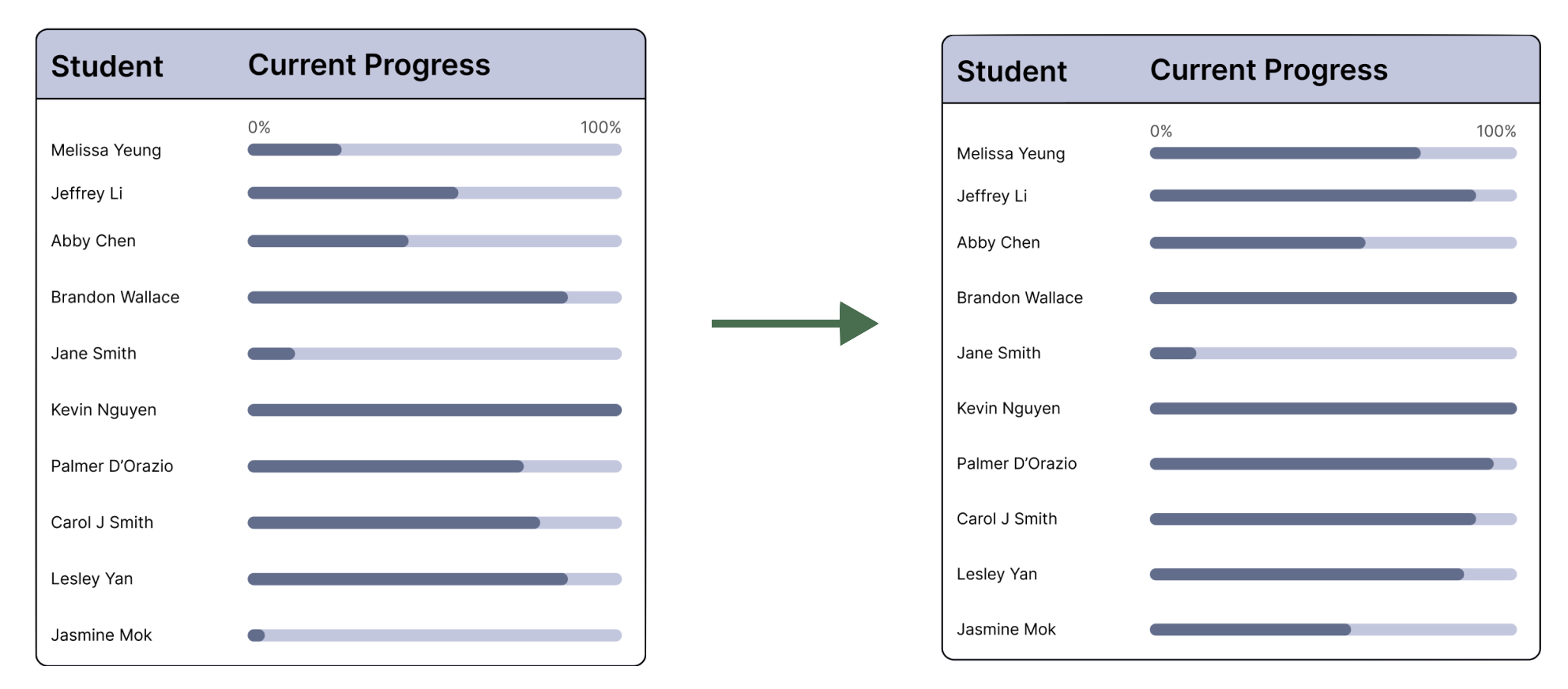
Removed text around the progress bar since individuals will not necessarily do tasks in the same order. We introduced greater feedback so that students understood the bar clearly measured “participation”
Same transformations as the instructor view to improve overall design

Instructor
Student Listener
For the last step of our project, we added animations on Figma to further demonstrate the capabilities of the dashboards.

Our most important revision among our animations was to have a dynamic live response section. Once a comment is posted, the entire box shifts in unison as shown here to the right. We modeled this on the Alla Kholmatova reading the movement of text off one box and into the next box elicits a balanced and stable animation which has a decisive and certain brand feel (Kholmatova, 2017).
Instructor
Student Listener
Throughout this project, I learned a lot about how to represent data clearly and incorporate interactivity/animations along with that. Starting with the research we conducted about data displays and then about the personas, I felt well-prepared to create the dashboard even though I began the assignment slightly lost. I think the biggest challenge I faced but also the most important thing I learned during this unit was adding animations. Even though they were hard to understand at first, the animations really helped with the realism of the prototype, and this skill will definitely be useful in the future.
It was hard to not feel trapped within our initial designs; I felt that sometimes it was complicated to implement changes. However, the critiques we got from the class and our professors helped move us along in the process and find issues we weren’t aware of. Overall, the final product was something our group was proud of and that taught us a lot because we went through the entire design process, from beginning to end.
Reflection